Flexbox
Flex Container: Element that has display set to flex
Flex Items: Direct children of flex container
If the container element does not have an width/height the elements inside it will only use the min required space. If the elements are not aligned properly on the screen this could be the reason
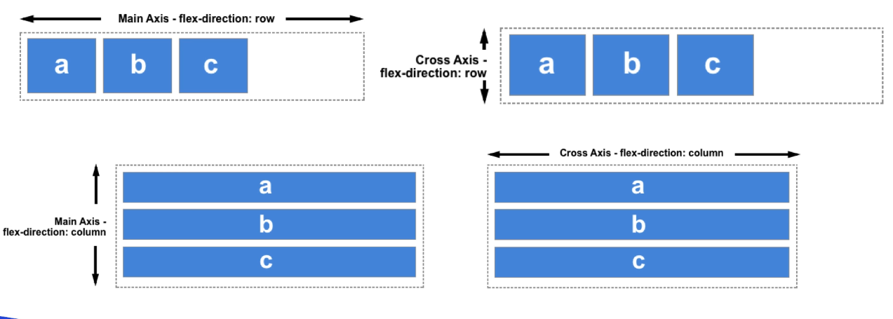
Flexbox Axis
By default the flex-items are aligned horizontally
This can be changed by setting the flex-direction property
In default orientation the horizontal axis is called main axis and the vertical axis is called cross axis
This is reversed when flex-direction is changed to be vertical

justify-content : Position flex items wrt. main axis
align-items : Position flex items wrt. cross axis
align-self : Position flex items wrt. cross axis (Applied on item)
align-content : Set the spacing between the lines
align-content has no effect if there is only one row of flex items
Other Properties
flex-wrap : Wrap the flex items if they cannot fit on the same line
order : Rearrange flex items along the main axis (Applied on item)
flex-basis : Sets the min width of the element (Applied on item)
flex-grow : Sets the factor by which the item will grow item (Applied on item)
flex-shrink : Sets the factor by which the item will shrink (Applied on item)
flex : Shorthand for the above three properties (Applied on item)
flex-flow : Shorthand for flex-direction and flex-wrap
Flex property can be used as follows:
- flex: grow shrink basis
- flex: grow
Miscellaneous Points
Flex items by default try to occupy the least space required while also occupying only a single line (width: max-content)
If we reduce the size of the screen or there is no space to fit the items on a one line then the flex items are allowed to wrap until they reach their smallest size possible (width: min-content)
After this point the items will start to overflow from the container
When using flex-grow on elements justify content will have no effect (as the elements will use up all the available space on the main axis)
Default Values
- flex-shrink : 1
- flex-grow : 0
- flex-basis : auto
- align-items : stretch
If we set flex-shrink: 0 then the items will have size equal to max-content
When flex-wrap: wrap then the elements shrink till max-content is reached and then start moving on to the next line without getting any smaller
When flex: 1 then the value of flex-basis is set to 0 automatically
Flex looks at the size of the content. So if an item has more padding than the others it would end up occupying more space
Setting flex-basis: 100% or flex : 1 will cause all the children to become same size
flex-basis is dependent on the direction of the flex container. A flex container with direction as column will cause the height of the element to change